Introduction
CSS is the language we use to style a Web page.
CSS stands for Cascading Style Sheets. CSS describes how HTML elements are to be displayed on screen, paper, or in other media. CSS saves a lot of work. It can control the layout of multiple web pages all at once. External stylesheets are stored in CSS files.
CSS is used to define styles for your web pages, including the design, layout and variations in display for different devices and screen sizes.
HTML was created to describe the content of a web page, like:
<h1>This is a heading</h1>
<p>This is a paragraph.</p>
When styling is defined on every page of a site, it is a nightmare for web developers. CSS removed the style formatting from the HTML page!
Syntax
A CSS rule consists of a selector and a declaration block.
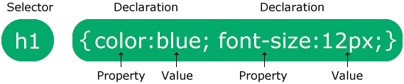
- The selector points to the HTML element you want to style.
- The declaration block contains one or more declarations separated by semicolons.
- Each declaration includes a CSS property name and a value, separated by a colon.
- Multiple CSS declarations are separated with semicolons, and declaration blocks are surrounded by curly braces.
Box Model
All HTML elements can be considered as boxes. In CSS, the term "box model" is used when talking about design and layout. The CSS box model is essentially a box that wraps around every HTML element. It consists of: content, padding, borders and margins. The image below illustrates the box model:
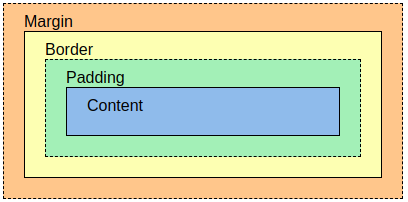
- Content - The content of the box, where text and images appear
- Padding - Clears an area around the content. The padding is transparent
- Border - A border that goes around the padding and content
- Margin - Clears an area outside the border. The margin is transparent
The box model allows us to add a border around elements, and to define space between elements.
Positioning
The position property specifies the type of positioning method used for an element.
There are five different position values:
- static
- relative
- fixed
- absolute
- sticky
Elements are then positioned using the top, bottom, left, and right properties. However, these properties will not work unless the position property is set first. They also work differently depending on the position value.
position: static;
HTML elements are positioned static by default.
An element with position: static; is not positioned in any special way; it is always positioned according to the normal flow of the page.
          div.static {

          position: static;

          border: 3px solid #73AD21;

          }
position: relative;
An element with position: relative; is positioned relative to its normal position.
div.relative {

          position: relative;

          left: 30px;

          border: 3px solid #73AD21;

          }
position: fixed;
An element with position: fixed; is positioned relative to the viewport, which means it always stays in the same place even if the page is scrolled. The top, right, bottom, and left properties are used to position the element.
div.fixed {

          position: fixed;

          bottom: 0;

          right: 0;

          width: 300px;

          border: 3px solid #73AD21;

}
position: absolute;
An element with position: absolute; is positioned relative to the nearest positioned ancestor (instead of positioned relative to the viewport, like fixed).
However; if an absolute positioned element has no positioned ancestors, it uses the document body, and moves along with page scrolling.
Note: Absolute positioned elements are removed from the normal flow, and can overlap elements.
div.absolute {

          position: absolute;

          top: 80px;

          right: 0;

          width: 200px;

          height: 100px;

          border: 3px solid #73AD21;
}
position: sticky;
HTML elements are positioned static by default.
An element with position: sticky; is positioned based on the user's scroll position.
A sticky element toggles between relative and fixed, depending on the scroll position. It is positioned relative until a given offset position is met in the viewport - then it "sticks" in place (like position:fixed).
div.sticky {

          position: -webkit-sticky; /* Safari */

          position: sticky;

          top: 0;

          background-color: green;

          border: 2px solid #4CAF50;
}
Flexbox
To start using the Flexbox model, you need to first define a flex container.
The flex container becomes flexible by setting the display property to flex:
.flex-container {
display: flex;
}
The flex container properties are:
- flex-direction
- flex-wrap
- flex-flow
- justify-content
- align-items
- align-content
flex-direction
The flex-direction property defines in which direction the container wants to stack the flex items.
columnstacks the flex items vertically,from top to bottomcolumn-reversestacks the flex items vertically, but from bottom to toprowstacks the flex items horizontally, from left to rightrow-reversestacks the flex items horizontally, but from right to left
flex-wrap
The flex-wrap property specifies whether the flex items should wrap or not.
wrapspecifies that the flex items will wrap if necessarynowrapspecifies that the flex items will not wrap (this is default)wrap-reversespecifies that the flexible items will wrap if necessary, in reverse order
flex-flow
The flex-wrap property is a shorthand property for setting both the flex-direction and flex-wrap properties.
.flex-container {
display: flex;
flex-flow: row wrap;
}
justify-content
The justify-content property is used to align the flex items horizontally.
centeraligns the flex items at the center of the containerflex-startaligns the flex items at the beginning of the container (this is default)flex-endaligns the flex items at the end of the containerspace-arounddisplays the flex items with space before, between, and after the linesspace-betweendisplays the flex items with space between the lines
align-items
The align-items property is used to align the flex items vertically.
centeraligns the flex items at the middle of the containerflex-startaligns the flex items at the top of the containerflex-endaligns the flex items at the bottom of the containerstretchstretches the flex items to fill the container (this is default)baselinealigns the flex items such as their baselines align
align-content
The align-content property is used to align the flex lines.
space-betweendisplays the flex lines with equal space between themspace-arounddisplays the flex lines with space before, between, and after themstretchstretches the flex lines to take up the remaining space (this is default)centerdisplays the flex lines in the middle of the containerflex-startdisplays the flex lines at the start of the containerflex-enddisplays the flex lines at the end of the container
Grid
The CSS Grid Layout Module offers a grid-based layout system, with rows and columns, making it easier to design web pages without having to use floats and positioning.
An HTML element becomes a grid container when its display property is set to grid or inline-grid.
.grid-container {
display: grid;
}
.grid-container {
display: inline-grid;
}
Grid containers consist of grid items, placed inside columns and rows.
- grid-template-columns
- grid-template-rows
- justify-content
- align-content
grid-template-columns
The grid-template-columns property defines the number of columns in your grid layout, and it can define the width of each column.
The value is a space-separated-list, where each value defines the width of the respective column. If you want your grid layout to contain 4 columns, specify the width of the 4 columns, or "auto" if all columns should have the same width.
.grid-container {

          display: grid;

          grid-template-columns: auto auto auto auto;

}
.grid-container {

          display: grid;

          grid-template-columns: 80px 200px auto 40px;

}
grid-template-rows
The grid-template-columns property defines the defines the height of each row.
The value is a space-separated-list, where each value defines the height of the respective row.
.grid-container {

          display: grid;

          grid-template-rows: 80px 200px;

}
justify-content
The justify-content property is used to align the whole grid inside the container.
- space-evenly
- space-between
- space-around
- center
- start
- end
align-content
The align-content property is used to vertically align the whole grid inside the container.
- space-evenly
- space-between
- space-around
- center
- start
- end
Child Elements (Items)
A grid container contains grid items.
By default, a container has one grid item for each column, in each row, but you can style the grid items so that they will span multiple columns and/or rows.
grid-column
The grid-column property defines on which column(s) to place an item.
You define where the item will start, and where the item will end.
Note: The grid-column property is a shorthand property for the grid-column-start and the grid-column-end properties.
To place an item, you can refer to line numbers, or use the keyword "span" to define how many columns the item will span.
Make "item1" start on column 1 and end before column 5:
.item1 {

          grid-column: 1 / 5;

}
Make "item1" start on column 1 and span 3 columns:
.item1 {

          grid-column: 1 / span 3;

}
grid-row
The grid-row property defines on which row to place an item.
You define where the item will start, and where the item will end.
Note: The grid-row property is a shorthand property for the grid-row-start and the grid-row-end properties.
To place an item, you can refer to line numbers, or use the keyword "span" to define how many columns the item will span.
Make "item1" start on row-line 1 and end on row-line 4:
.item1 {

          grid-row: 1 / 4;

}
Make "item1" start on row 1 and span 2 rows:
.item1 {

          grid-column: 1 / span 2;

}
grid-area
The grid-area property can be used as a shorthand property for the grid-row-start, grid-column-start, grid-row-end and the grid-column-end properties.
Make "item8" start on row-line 1 and column-line 2, and end on row-line 5 and column line 6:
.item8 {

          grid-area: 1 / 2 / 5 / 6;

}
Make "item8" start on row-line 2 and column-line 1, and span 2 rows and 3 columns:
.item8 {

          grid-area: 2 / 1 / span 2 / span 3;

}
Grid Properties
| Property | Description |
|---|---|
| column-gap | Specifies the gap between the columns |
| gap | A shorthand property for the row-gap and the column-gap properties |
| grid | A shorthand property for the grid-template-rows,
grid-template-columns, grid-template-areas, grid-auto-rows,
grid-auto-columns, and the grid-auto-flow properties |
| grid-area | Either specifies a name for the grid item, or this property is a shorthand property for the grid-row-start, grid-column-start, grid-row-end, and grid-column-end properties |
| grid-auto-columns | Specifies a default column size |
| grid-auto-flow | Specifies how auto-placed items are inserted in the grid |
| grid-auto-rows | Specifies a default row size |
| grid-column | A shorthand property for the grid-column-start and the grid-column-end properties |
| grid-column-end | Specifies where to end the grid item |
| grid-column-gap | Specifies the size of the gap between columns |
| grid-column-start | Specifies where to start the grid item |
| grid-gap | A shorthand property for the grid-row-gap and grid-column-gap properties |
| grid-row | A shorthand property for the grid-row-start and the grid-row-end properties |
| grid-row-end | Specifies where to end the grid item |
| grid-row-gap | Specifies the size of the gap between rows |
| grid-row-start | Specifies where to start the grid item |
| grid-template | A shorthand property for the grid-template-rows, grid-template-columns
and grid-areas properties |
| grid-template-areas | Specifies how to display columns and rows, using named grid items |
| grid-template-columns | Specifies the size of the columns, and how many columns in a grid layout |
| grid-template-rows | Specifies the size of the rows in a grid layout |
| row-gap | Specifies the gap between the grid rows |